Magazine review: Frankie & Cereal

Hello to you all ! It’s been a while. I’ve been quite busy and stressed at work these past weeks. So much that for a while I didn’t feel any desire to do anything than sleep. Or maybe read.

I’d like to present you two magazines I discovered recently, and liked. I found them both at a quite special library here in Lyon, called DATTA.

They sell magazines from all over the world, some interesting books, a few shirts, some nice jewellery and stationery. The back room of the shop is a gallery, where DATTA hosts the works of artists from local art scenes, French and international, evolving in a variety of universes. In other words, a cool place I like to visit.

There, I bought the volume 8 of CEREAL magazine as a gift for my boyfriend, then the issue 62 of FRANKIE for myself.

FRANKIECOVER-CARLAFUENTES_905

CEREAL_magazine_cover8

FRANKIE is a bi-monthly Australian magazine, covering design, art, photography, fashion, travel, music, craft, interiors and real-life stories.
The artwork on the cover caught my eye instantly, and the colorful pages didn’t disappoint. There are beautiful illustrations inside to introduce the real-life stories or interviews. I feel a uniformity between the different pictures that emerge through the light and tones. The variety of topics discussed makes it more pleasant to read, there’s a nice subject to read for every moment of your day or week.
Frankie is a magazine you can relate to and it feels good.
Visit Frankie’s website for wallpapers with cute vintage patterns.

FRANKIE_salted-caramel-popcorn-cake

FRANKIE_woodland-sheets-big

FRANKIE_grilled-cheese-social-1

FRANKIE_issue-64-2

FRANKIE_issue-64-5

FRANKIE_issue-64-3

CEREAL is a quarterly travel and lifestyle magazine, based in Bristol, UK.
It seems to me that it presents a quite unique aesthetic. There is, in some way, a contrast between the visual minimalism of the graphic elements and the rich and complete text that accompanies the pictures. I can’t tell about the previous volumes, but the volume n°8 was all about grey and blue tones, textures of white, that are all very actual tones and colors, and strongly represented in the various social medias. You could say we are almost bored with this minimalism everywhere. But CEREAL was just right and beautiful.
GuidedByCereal provides series of travel guides on the website guidedbycereal.com, with stunning photography. There are currently guides to 13 cities and one will be added each month.

cropped-klaune-website-banner.jpg

CEREAL_banner3

CEREAL_VW-portrait1

CEREAL_VW_landscape1

CEREAL_portrait43

CEREAL_ESK-Landscape3

I can’t do anything else than advise you to have a look at these great magazines. It’s the kind that leaves you happy and inspired, but hesitant: Should you expose it on your wall as if it was a painting? or religiously keep it on your bedside table for a inspiring shot anytime?

Bonus: There was a poster in Frankie #62. So the question is solved, at least for this month…

Milk magazine favorites

I buy the magazine MilK decoration every time it’s out. Meaning every 3 months. Meaning I spend more time waiting than reading. But it’s worth it, because it’s my favorite magazine so far.
MilK Decoration is a “high-end” magazine, whose mission is to inspire young contemporary families, urban, cosmopolitan and connected in terms of style and decoration. An intimate look at the lifestyle of the tribes of today.

I like that they portray the families who live among the decoration and interior scenes that are shown. Of course, those families are mostly composed of artists/designers/architects and cute kids, wearing cool clothes, but the whole portrait is delightful. Once you’ve done reading Milk Decoration, you want to be part of those families, or even build your own following their example. (whew, I happen to be an architect, that’s something already!) That’s not less interesting than wanting to be like Cara Delevingne while reading Cosmopolitan. (No judgement, that just didn’t work on me).

So, in case you don’t know this magazine yet, let me share with you a selection of my favorite homes and families from some of the previous editions.


Fons Cohen, owner and founder of the brand Imps & Elfs (fashion for kids), his wife Katja and their three daughters moved into a former church in the south of Amsterdam.

former nave of the church

I like the cozy atmosphere created by bricks and wood in the former nave of the church.

I miss my Playmobils sometimes

And I miss my Playmobil sometimes. I wish I thought of a cool way to display them when I was a kid. Maybe it’s not too late.

The cute kids. And wooden wall.

The cute kids. And wooden wall.


Jo and Graham Atkins-Hughes posed their bags into their new home in London at the end of spring 2001. Jo is a stylist and Graham a photographer. (Exception in Milk: they don’t have kids. Yet.) They were accompanied during renovation by Stan and David, a formidable duo from artisans from Essex consisting of a father and his son.

Pretty yellow flowers

It could be a lamp. Bright yellow flowers.

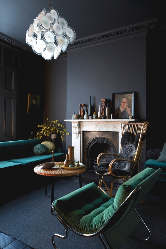
Dark grey, dark green, dark blue

Dark colors make you feel warmer. The ceiling light seems oyster inspired.

Eucalyptus my favorite

Eucalyptus my favorite. I like the neutral color and the geometry of the leaves.


Melanie, creator of Simple Kids, and her three daughters. She walked past that house dozens of times before seeing a sign “For Sale”. She was quick to visit and discovered that the original features were retained.

anvers-5

I like the pillows a lot, and the matching lamp and flowers. I'm sure it tastes like redberries.

I like the pillows a lot, and the matching lamp and flowers. I’m sure it tastes like redberries.

anvers-59-3

My soft toys took over my parents' attic. They are too big to quietly stand on a shelf.

My soft toys took over my parents’ attic. They are too big to quietly stand on a shelf.


Co-founder of Serendipity, Elisa Bartillat has launched a challenge: to rehabilitate and completely redecorate a little austere castle of the nineteenth century, located in Normandy.

Gold to dress up a mix of patterns.

Gold to dress up a mix of patterns.

It reminds me of the kids' room in Mary Poppins. The 1964's movie, with Julie Andrews.

It reminds me of the kids’ room in Mary Poppins. The 1964’s movie, with Julie Andrews.

A less common picture of Audrey Hepburn. I'm more willing to take care of myself when it gets colder outside, in the warmth of the bathroom.

A less common picture of Audrey Hepburn. I’m more willing to take care of myself when it gets colder outside, in the warmth of the bathroom.


Stewart and Jane Devlin left England for the East Coast of the United States nine years ago. She, british, works at Gap, where she is creative director of the brands BabyGap and InfantGap. He, originally from Northern Ireland, runs a graphic design agency. Tilly, six, is the cute girl.
Hudson_Milk_001

Delicate botanical patterned wallpapers are my thing.

Delicate botanical patterned wallpapers are my thing.

Hunter boots and leather bags.

Hunter boots and leather bags.

I have to admit I kind of like the ceiling light, and the shadows. Is it creepy that it's made of horns...?

I have to admit I kind of like the ceiling light, and the shadows. Maybe it’s not made of real horns.


Muriel Bardinet is interior designer and creator of Dune 234 antique store in Brussels. She excels in creating poetic and serene atmospheres and loves above all harmonious or contrasting combinations of objects. The house, located in Ixelles district in the Belgian capital, was formally an orphanage, and a Japanese restaurant.

The areas of the first and ground floors were made of concrete covered with sand color Mortex, thus connecting with the original cement tiles,  found under the restaurant's pine flooring.

The areas of the first and ground floors were made of concrete covered with sand color Mortex, thus connecting with the original cement tiles, found under the restaurant’s pine flooring.

brussels_img_1415

Starry ceiling in Lou's bedroom.

Starry ceiling in Lou’s bedroom.

brussels_mg_0632


In facts, MilK is 3 magazines:
MilK Kid’s collection offers a modern journey into the world of childhood.
MilK Japan is the special edition for Japan, also picturing childhood.
MilK Decoration, that you just heard of.

If you want to see more cute kids, families and interiors, I suggest you check http://www.milkmagazine.net

FÄRG & BLANCHE

FÄRG & BLANCHE is a Stockholm based design studio, founded in 2010 by the Swedish designer Fredrik Färg and designer Emma Marga Blanche, born in France. As a studio, they work across a wide variety of fields, they collaborate with established Swedish furniture brands, produce their own collections and limited art pieces for galleries in Milan, New York and Tokyo. They are known for “their experimental stance, where each expression informs the other, they effortlessly move between the exclusive hand made one off and the industrially produced, without ever losing their distinctive touch.”

Have a look at this amazing video. A collaboration art piece, mixing dance, film, design and music, directed by Swedish architect Erika Janunger and choreographer Oskar Frisk. The furniture was designed especially for this film by Färg & Blanche. The film pictures two people inhabiting a world where hidden powers effects movements and events in unexpected ways.
I’m thrilled with these grey tones producing a so special atmosphere, neutral and almost cold, the dancers manage to warm up through their moves.


Now, check out their website to discover their designs. http://www.fargblanche.com

Longing to Fly / Longing to Fall from Erika Janunger on Vimeo.

CAPRISUITE guest house

In the heart of the ancient village of Anacapri “above Capri”, the CAPRISUITE is an exclusive cocoon for refined aesthetes. The locals say Anacapri is “what Capri used to be like, many many years ago”. Giuliano Andrea dell’Uva, a young architect from Napoli, designed this hideaway in the remains of a 16th century convent, beside the San Michele church. Two simple rooms, designed in hues of yellow and blue, in tribute to the sun and the Mediterranean sea. There, you’ll be living alongside designer furniture, modern art and luxury (look at the bathrooms!).

CAPRISUITE
Via Finestrale, 9
80071 Anacapri
+39 335 528 0647

caprisuite_006-03

soleil-d-hiver-a-capri-2

soleil-d-hiver-a-capri-3

caprisuite_001-03

caprisuite_003-03

Credenza designed by the architect. Waxed iron structure, wooden recovery doors and antique for opening

Credenza designed by the architect. Waxed iron structure, wooden recovery doors and antique for opening

Another amazing thing to know about CAPRISUITE: the architect designed a lot of the furniture himself, like the credenza above, and they are available for purchase in the CAPRISUITE shop ! How cool is that? Most of the tableware, like dishes, coffee cups, pitchers and jugs, are also available.

And the tour continues at the two bedrooms.

The blue room, with a basin-bath in front of the window and along the wall a metal mantle fireplace.

The blue room, with a basin-bath in front of the window and along the wall a metal mantle fireplace.

blueroom03

Vaults several hundred years old, cement tiles from early twentieth century, the memory of the place confronts the radical modernity.

Vaults several hundred years old, cement tiles from early twentieth century, the memory of the place confronts the radical modernity.


Hand painted bedspread signed by Livio de Simone. A resumed fantasy created in 1972 for Capri.

Hand painted bedspread signed by Livio de Simone. A resumed fantasy created in 1972 for Capri.

yellowroom_02

Arrange the bathroom in these cramped walls was nearly  impossible.  It only took a wide swing door opened to the bedroom, a sink placed at the window and horizontal striped fabric Livio de Simone protected by plastic to give the illusion of space. Gray resin on the floor, as in other parts of the house.

Arrange the bathroom in these cramped walls was nearly impossible.
It only took a wide swing door opened to the bedroom, a sink placed at the window and horizontal striped fabric Livio de Simone protected by plastic to give the illusion of space. Gray resin on the floor, as in other parts of the house.


Pictures from:
http://www.caprisuite.it
http://www.cotemaison.fr

A post by Lise


MONOQI favorites

MONOQI is an online design shop, which was presented to me recently by Anuka. Since 2012, they have been collecting hard-to-find and limited-edition design products, making them available for a short time on MONOQI.com. Their employees from 22 nationalities search the best contemporary design and present every day the products of 5 designers.
The products well reflect the current trends and are most of the time affordable for designer pieces. They are sill too expensive for me but give sometimes great inspirations, DIY ideas and allow to discover local designers.
I usually check the new products once a week or so. Well, today I made for you a selection of the products I liked recently.

The Woodstock Wardrobe by Jeroen van Leur (NL), is a minimalist object that you can assemble in seconds to hang your favorite garments. Made of oak wood, copper, steel.

Woodstock wardrobe by Jeroen Van Leur

Woodstock wardrobe by Jeroen Van Leur

The wardrobe is part of the Woodstock Collection, a lightweight and mobile product, inspired on the principle of tent poles. The modular system combines wooden sticks and copper connection parts.

Jeroen_van_Leur_Woodstock_10

The Mobius wall desk is a product by COCO&CO Edition, a label based in Bourg-en-Bresse, France. All their creations are produced within 50kms around their office to keep a minimal environmental impact. I picture this wall desk in an entryway, really practical to leave the keys or the mail when you come home. Made of epoxy-painted steel.

Moebius wall desk by COCO&CO Edition

Moebius wall desk by COCO&CO Edition

This White stool by Berlin-based label Noodles Noodles & Noodles Corp. would be perfect in my future home-office space. The stool is part of a collection of European-made, handcrafted interior designs, like a touch of vintage to mix with modern or classic furniture. Made from brushed pine wood and sturdy steel, with an adjustable seat.

set_2094

So would you buy something at MONOQI? Let me know what you think of this webshop.


Pictures from:
http://www.monoqi.comhttp://noodles.de/store.htmlhttp://www.modefabriek.nl

A post by Lise.

String© shelves alternative

You all know the String shelving system, I think, designed in 1949 by Swedish architect Nils Strinning. You can find them in different colors, starting around 150€ for the String Pocket. Yes, that is expensive for a shelving system made of laquered steel and MDF, but for a designer piece and must-have for 60 years, not so much I guess. If you’re not willing to spend so much money, I have a few alternatives for you.

Start by asking your relatives if they don’t have a similar shelving system, that they might have forgot somewhere in the basement or attic after moving it from kitchen to bathroom to garage years after years. That’s how I found mine.
My step-mother was about to throw it and I asked to keep it for my apartment. She had it when she was a teenager, in her bedroom. She kept it since then, in her different homes, and when she got bored of its original black color she painted it white. These shelves have been lately spotted in the toilets… They are now in a good place in my bedroom, styled with some plants and yellow accessories. (I have a third shelf available but I didn’t feel like using it for now.)

Another alternative can be found using the IKEA Ekby Gällö wall side unit, designed by Jon Karlsson. They are available in 19 or 29cm depth, for less than 20€. Just add some wood planks bought at your local hardware store and you’re good. If you are not in the mood to pay a visit to the store, IKEA also provides a combined version of Ekby Gällö and Ekby Järpen, birch veneer shelves, for 78€.

Manhattan-nest.com

Manhattan-nest.com

Less similar but offering a design touch to your interior, are the Botkyrka wall shelves, again by IKEA, released in February. Made of powder-coated steel, they are available in white, dark grey and yellow and cost only 25€. They are great for both storage and display, in your kitchen or office. Their clean and minimalistic look put them in line with the current trend of Scandinavian simplicity, functionality and minimalism.

Ikea-NEW-BOTKYRKA-wall-shelves

Ikea_keuken_wandplank_Botkyrka_wit

Botkyrka is actually (more than) inspired by the VIPP shelves (small version: €149, large version: €249). The VIPP has a rubber mat and visible decorative screws.

RAW Design blog Vipp shelf (1)


For your information, if you live in the USA the IKEA Ekby Gällö + Järpen are only 44$, around 32€, and if you live in China, I hate you (just kidding), it will only costs you 285 yen, around 2€.
I still wonder how such a big difference is possible, even considering a lower price of wood products in USA and lower living standards and labour costs in China.

Pictures from:
http://www.pinterest.com
http://www.ikea.com
http://www.livethemma.ikea.se
http://www.manhattan-nest.com
http://www.20kvadrat.se
http://www.string.se

A post by Lise.

The brass trend

Choosing to display brass in your interior is not as innocent as it seems, it binds historical aspect to contemporary yearning. I guess the brass trend is part of a larger interest for more meaningful and long-lasting elements at home. From Scandinavian style, starring neutrals tones and raw materials, to modern bohemian interiors, introducing colors and patterns with a mix of Victorian furniture, brass is here to stay.


In the industrial interior style, topical for the last decade, the use of metal is mandatory. But even established styles know seasonal changes. This winter we saw a lot (or should I say tons?) of copper pictured in interior design and styling, copper has this characteristic brown/pink color that radiates warmth and comfort, thus makes it perfect for winter decoration. I heard this spring would be the brass era. But what exactly is a trend when it is related to a raw material, commonly used to produce hardware objects? How people could all be attracted to brass at the same time? (I mean before the sheep effect.) That was intriguing me, so I dug a little.

Brass is an alloy, made from copper and zinc. Very easy to machine, it is relatively brittle compared to other metals and alloys. However, it remains the most widely used metal element among copper alloys. Brass has boomed with the industrial revolution of the 19th century, when new machines were designed, requiring precision parts. Brass is today affordable and easy to find in various forms as widespread on the metals market.

Quite soon after the end of the manufacturing process, without a surface treatment, the copper alloys get coated with a thin film of oxide, leading to a dull and browning effect. Evocative, patina gives brass warmth and an already-used feeling, creating an intimate relationship between user and material, the same you have when you get a second-hand object at a flea market. The patina appearing relatively quickly, you don’t even have to wait a hundred years to feel this intimacy and you will forget your drawer knobs are mass-produced and you bought them at a DIY store. Patina is a mark and a sign of time passing by, whereas owner’s life goes short. “Highly polished, bright brass hardware and lighting is gone; rustic, dull and hammered brass is in. » notes realtor.com.

We witness a return towards the importance of material symbolic, inducing touch; we are getting rid of those chrome and stainless steel we used to like, now seen as too cold and clinical. We are back to materials we habitually use, in accordance with climate and seasons rhythm. You will find brass where it is held to be inherently: mainly in kitchen and bathroom, in elements you touch everyday, like taps, door handles and drawer knobs. Brass is not typical of the so-called industrial style but more evocative of craftsmen workshops, small factories, repair shops, laboratories, and all places when men are at work, not machines. Brass is a humble material, a non-pretentious gold, for low-profile people. It reminds nautical activities, a simple and healthy way of life.

Brass is of course related to others trends. According to Lotta Agaton, interior stylist, or Josefin Hååg from the blog 20kvadrat (among others), grey will be the go-to color of 2014. Some pastel or beige walls have been spotted too, neutrals seem to be back. While light colors are usually associated with spring, this season is also about dark walls: black, grey, dark blue or green. They will both act as a background to enhance home accessories, especially metallic’s.

Painting walls is an investment, both in terms of money and time. It will be driven by the desire to develop accessories and fittings, that you can easily move, change or update with the seasons. It is almost as simple than put flowers in a vase; it is about giving ourselves the opportunity to be carefree.

I guess you didn’t miss it, but marble is everywhere (the Carrara white marble aspect). This noble and timeless material is revisited around objects serving everyday uses, from its mineral form to adhesive contact paper. You can marblelize anything with great efficiency. Associated to marble, brass will balance the coolness of the stone, making the whole thing sophisticated and not blingy. You can even play with subway tiles.


An article by Lise.